
Overview
Setting the scene
Let’s say you have a vision for a big landscaping project. You want to add a new garden, a gravel area for a fire pit and some privacy hedges. You don’t have much knowledge about plants, so like any good millennial, you start your search online. What plants grow well in my climate? Do they need shade or full sun? How do I know how much to get or how many? The decisions get a bit relentless and overwhelming.
Enter ‘Grow’
The Grow app streamlines home landscaping and tailors it to your specific yard’s location, climate and sunlight with plants that are available at your local garden store.
Project goals
Alongside the goal of streamlining landscape planning for the user, the Grow app has the potential to integrate and expand the offering of garden shops such as big box stores like Lowe’s. With a large clientele, and existing user base, this app could connect seamlessly into their existing app.
My role
UX/UI designer, individual design project
Timeline
3 weeks
Tools
Pen, paper, Illustrator, Photoshop, Adobe XD

1. discover
Domain research
I began the design process by researching the existing products that help people manage their plants or design their yard. I found only one app that helps users visualize their yard graphically. It did not, however, allow the users to draw a scaled plan. The other apps primarily focused on either plant discovery, or maintenance. This confirmed my hypothesis that there are not any comprehensive digital products that allow users to easily design and maintain their yard at the same time.
Interviews
To begin the needfinding process, I first set out to conduct a set of 12 interviews over 2 days at a local Lowe’s garden center. My goal was to discover how an app could aid in the planning and maintenance of those with a landscaping project and who the target user would be.
Insights
The interviews allowed me to understand what functionalities the app should have and who is likely to use it. The findings also verified my hypothesis which is that people get overwhelmed quickly when making landscaping decisions and those that are most likely to turn to an app for help would be those under 45.
- Many people don’t make a plan because they don’t think they have the skills that are required
- Many people just ‘wing it’ and do not buy plants based on the specific conditions that their yard has such as climate or orientation
- Younger people are more likely to integrate technology into their process as they do not have as much experience and are more tech savvy
- Some people wish it were easier to envision what their yard could look like in advance
Affinity mapping
I created an affinity map to summarize my research and connect the findings.
Personas and journey mapping
Based on the findings from my interviews, I created a set of personas as well as journey maps to further identify the pain points. Two of the personas are target users, and one is created as an anti-persona (Mohammed) to illustrate the type of user that I would not be designing for.
2. define
Core functions
Through the discovery process, I landed on a set of core functionalities that the app should provide:
- Easy, user friendly interface that allows them to draw a landscape plan- Input orientation, sunlight, and climate information
- Take photos and mock-up scenarios with plant imagery
- Have a database of plants that connect with local garden center inventory
- Make suggestions based in local climate data
- Create a watering and maintenance schedule with alerts
- Inspiration photos
User flow
Based on the insights from my research, I summarized the intended user flow of the app. In addition, I quickly drew out the initial architecture of the app.

3. design
4. prototype and test
Wireframes
I next created a set of wireframes in Adobe XD that would allow me to do initial user testing. The wireframes outlined all of the key functions of the app including documenting the existing yard and designing the new landscape plan.
User testing
The user testing was intended to gauge how easy the design process was for the user and to ensure that anyone with a baseline amount of technical knowledge for smartphones could create a landscape plan. The graphic style had to be easy to understand, the buttons had to be in obvious locations with clear functionality, and the flow had to guide the user through the process fluidly.
To see how the initial design performed, I had 5 users perform certain tasks within the app:
- Complete the onboarding and documentation process
- Design your new yard
- Use the dashboard to shop for your plants and explore the maintenance schedule
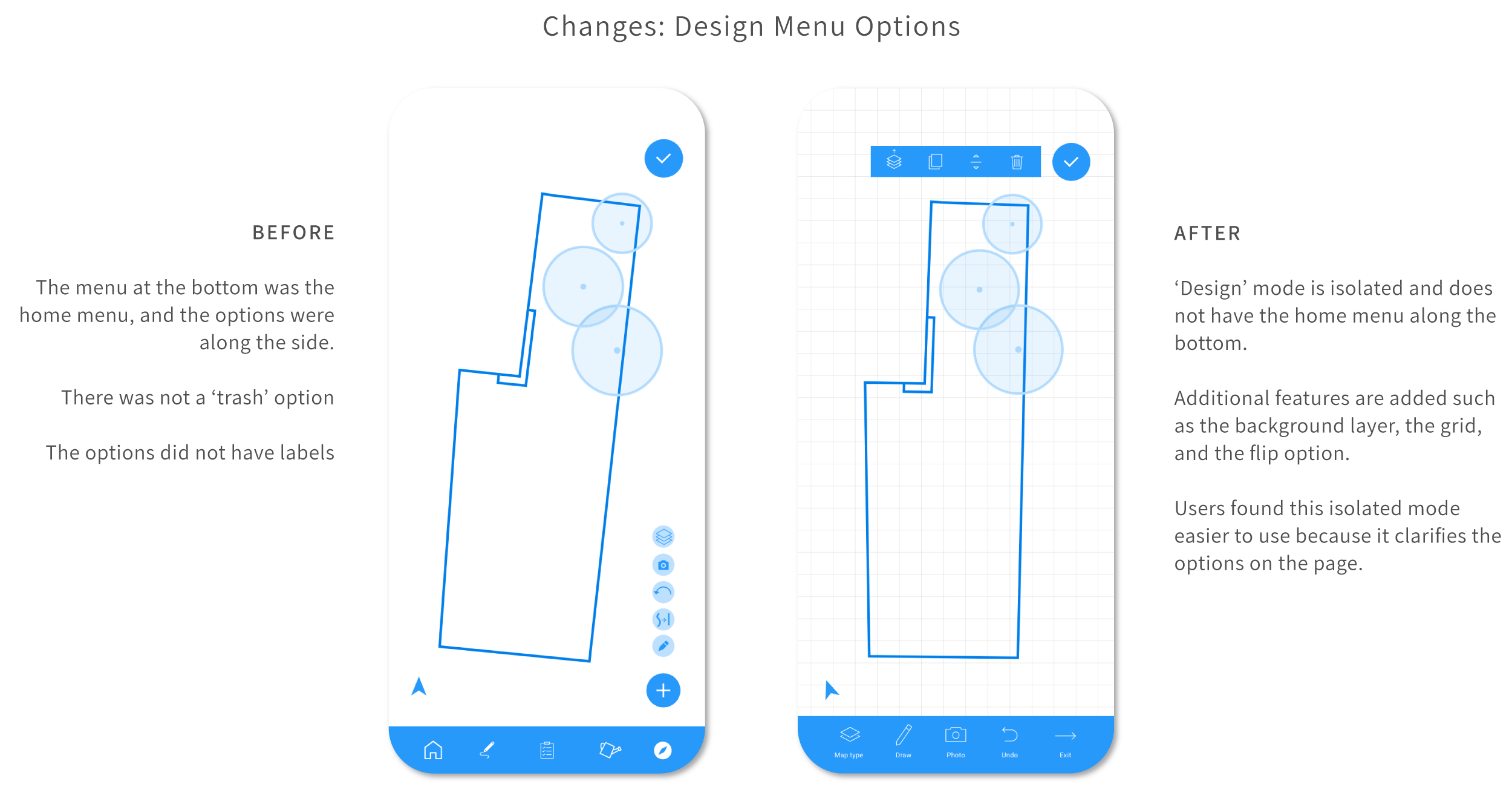
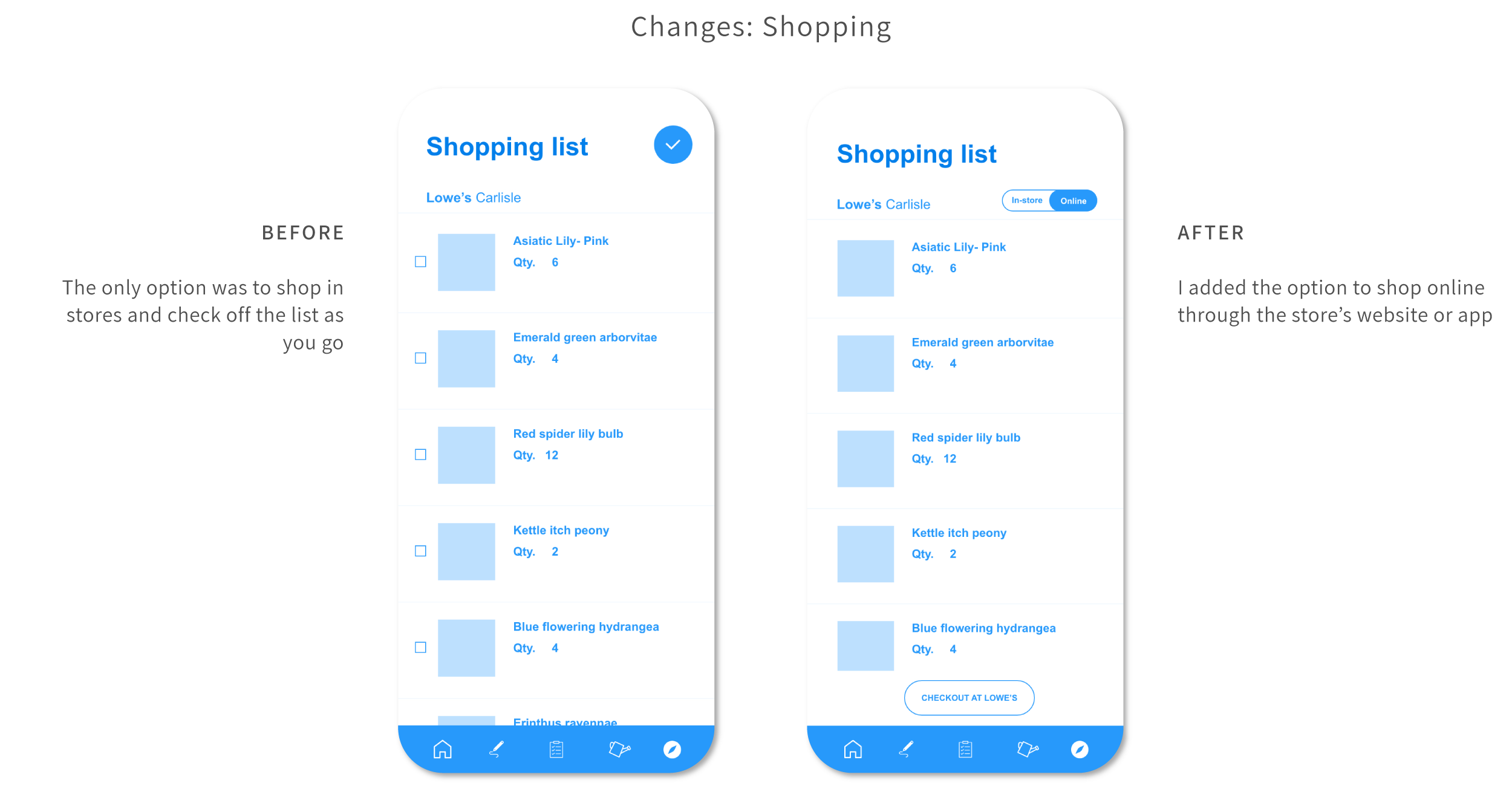
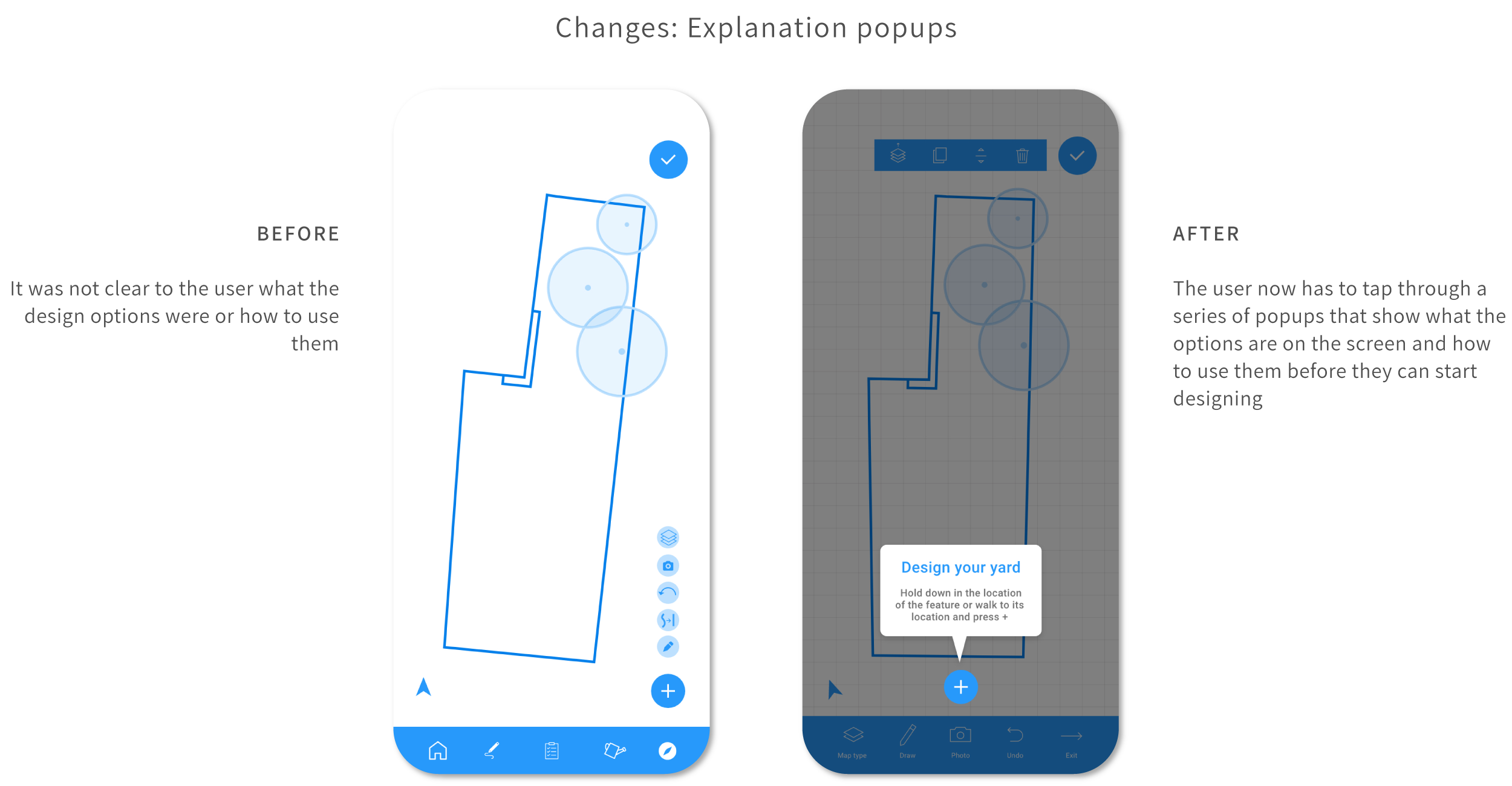
The users completed the tasks while thinking aloud and recording their thoughts. Overall, the testing went more smoothly than expected. I anticipated pain points in the documentation and design processes. I wasn’t sure if it would be easy to understand for those who are not accustomed to using architectural design software. Most of the changes were related to explaining to the user what to do when. You can see some of the changes I made below.
5. visual Design
Onboard and document your yard
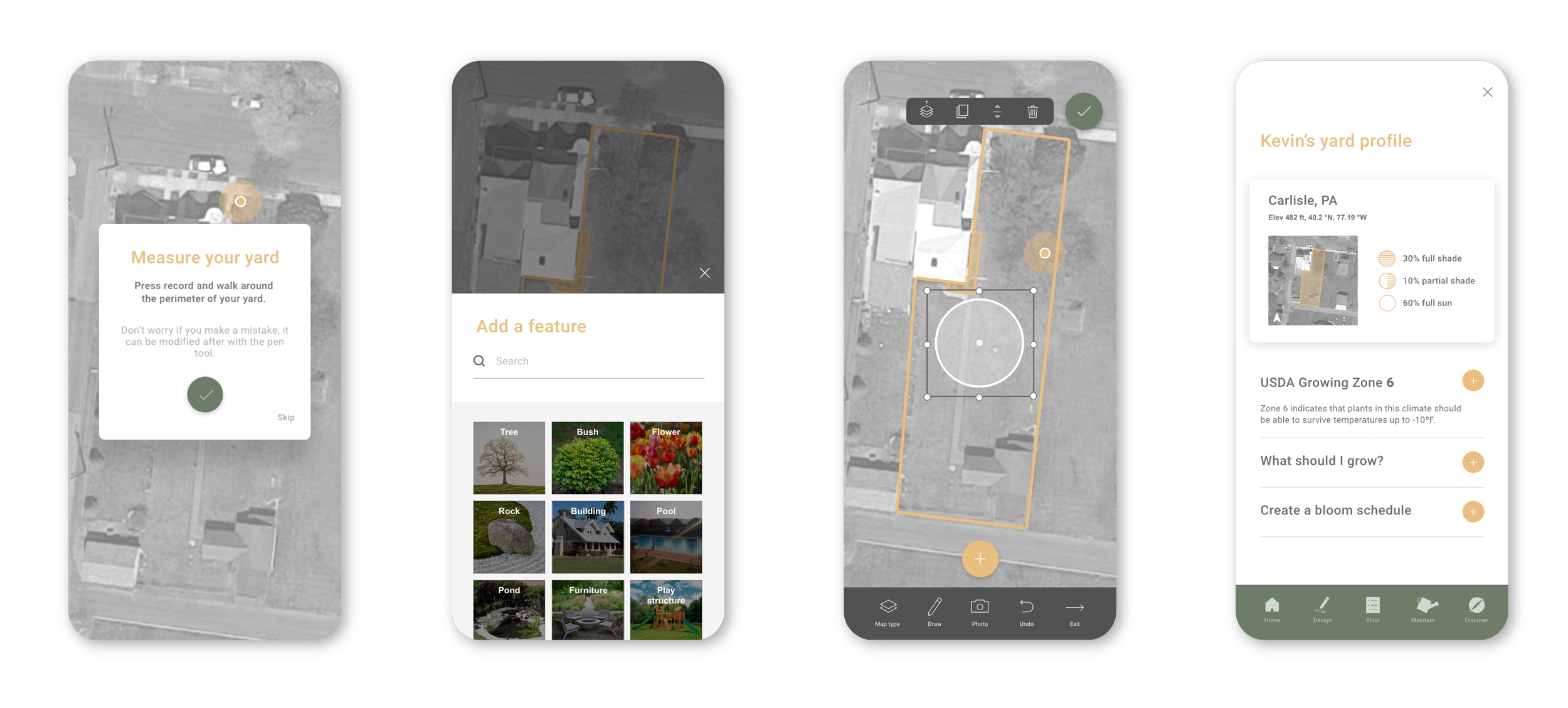
This process walks the user through the onboarding process and prompts them to document the spatial qualities of their yard such as the size and location of gardens and trees.
Design your yard
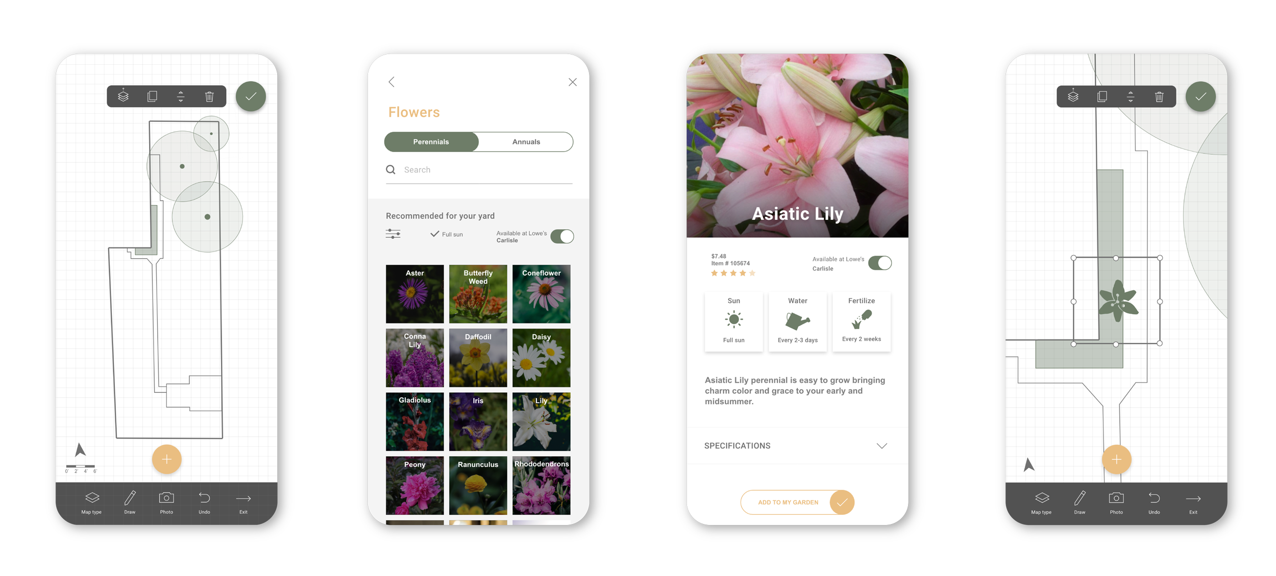
Next the user can add new gardens, plants and features to their plan. The default plants that appear are tailored to the specific requirements of their yard. They can also opt to only shop for plants that are available at their local shop.
Design your yard
Next the user can add new gardens, plants and features to their plan. The default plants that appear are tailored to the specific requirements of their yard. They can also opt to only shop for plants that are available at their local shop.
Shop, maintain and discover
Plants that are added to the plan are automatically added to the ‘shop’ section. Once planted, the user can track the watering, fertilizing and pruning schedules. They can also discover new information and inspiration if desired.
6. Reflection
Lessons Learnt
This app was challenging both in concept and in design. With a background in architecture, I am well acquainted with design software, but I wanted to ensure that this app was tailored to the every-person, not just to the designer. The interface had to allow for the flexibility of many different types of users and projects.
As with my other projects, I have learned that putting in the effort at the beginning to ensure the product is tailored to the correct clientele and serves their needs accurately is an essential step in the process. It is easy to skip to the graphic interface, but that only leads to further headaches down the road during user testing.
Challenges
The realization of this app would rely on having a large database that holds information about all types of plants in all different climates and be able to relate that to the climate information that the user provides as well as the inventory of different garden shops.
Because of that, it would make the most sense to partner with one or more large garden retailers that have their inventory online and up to date.
Next Steps
While I feel the final prototype resolved many of the critical issues that I encountered, I would love to run more rigorous user testing to ensure that it is a seamless as it could be. In addition, I would it would be great to partner with a large store, as mentioned previously, to see if they would find it valuable and ultimately hand it off to a developer to be fully realized.


